Best Practices for Custom Product Pages

– by Taya Franchville, App Growth Consultant at AppTweak
In December 2021, Apple announced the release of custom product pages (CPPs). App marketers can create custom product pages for their apps to highlight different functionalities, content, or offers than those shown on their default App Store product pages. By leveraging these page variations, marketers can target different segments of their target audience. With custom product pages, developers can:
- Create up to 35 customized variants of their default product page per language.
- Change their promotional text, screenshots, and/or app preview video with each variant.
Custom product pages are accessible via unique URLs (not via App Store organic search). Consequently, app marketers are able to better tailor their messaging to audiences coming from different channels by driving direct and referral traffic to the custom product page (and therefore improve the performance of paid ad campaigns, influencer marketing, and other marketing initiatives).
All ad networks that support unique URLs support custom product pages, including Apple Search Ads, which makes custom product pages a game-changer for UA managers. As with anything on the app stores, following best practices and store guidelines is imperative to the success of custom product pages.
Here are some best practices to follow when creating your own custom product pages:
1. Identify your user segments
Custom product pages should be designed around categories, or segments, of users that contain similar characteristics, needs, or behaviors. The purpose of segmentation is to identify and target specific customer groups with tailored marketing strategies and messages that resonate with their unique preferences and needs.
Different factors can be used to segment a market, including demographics (age, gender, income), psychographics (values, lifestyles, personalities), geography, and behavior (purchase history, product usage, brand loyalty, etc.). Businesses can improve their marketing performance by segmenting the market and developing targeted marketing campaigns. One tactic to achieve this is through using custom product pages, and there are a few strategies you can use to identify segments.
Spy on your competitors for inspiration
You can spy on your competitors’ strategies and gain ideas for your own tactics. One way to do this is by using AppTweak’s Timeline feature for Google Play and monitoring your competitors’ A/B tests. For example, let’s look at TikTok’s recent screenshot A/B tests.
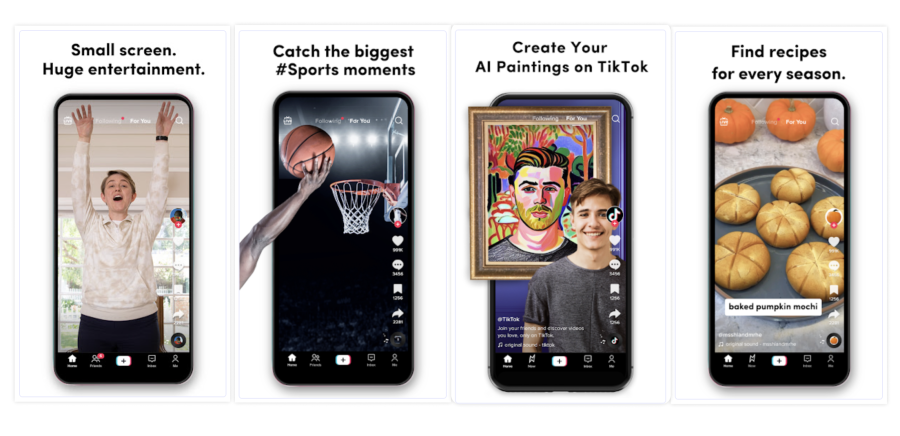
Recently, TikTok has experimented with different screenshots. In the image above, we see four screenshots derived from these tests, which hold the potential to serve as valuable references for segmentation, particularly for TikTok‘s competitors. These segmented categories could be effectively leveraged to create a minimum of 4 custom product pages catering to diverse user interests. These include general entertainment, sports, AI, and food. However, supplementary options also exist, including trending content, art, recipes, and seasonal segments.
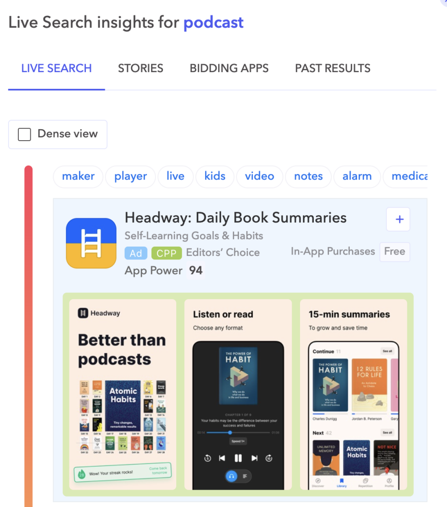
You can also use CPPs from other apps and games to gain strategy ideas! For example, here, we can see that Headway is running a CPP via Apple Search Ads on the keyword “podcast” that claims their app is “better than podcasts.” This is an interesting technique, as they’re targeting a keyword that does not directly apply to their app and hoping that users will download their app instead of a podcast app.
Mine user reviews for ideas
Another effective method for generating segment ideas involves mining store user reviews. By carefully analyzing feedback from your users, you can uncover valuable insights that can be harnessed to gain a competitive edge. For instance, Soundcloud collaborated with AppTweak in 2022 to extract valuable insights from user reviews, and then used this information to develop a successful CPP.
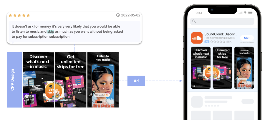
After conducting an analysis of user reviews using AppTweak’s Managed Services, SoundCloud successfully identified a notable level of user satisfaction concerning the app’s free features, specifically the ability to skip tracks, which are not available on competing platforms. Using this valuable insight, SoundCloud strategically leveraged the findings to develop a highly tailored custom product page that showcased these features. The outcomes achieved were impressive: SoundCloud‘s conversion rate for this targeted campaign surpassed that of their default page by an impressive 58%, resulting in cost savings of 39% compared to their projected cost to acquire an equivalent customer base.
Test our identified user segments
You can either use consumer data to identify user segments or to analyze the potential success of an identified segment. If you’re lacking user data, or want another route to measure success, don’t be afraid to test. Designing a compelling CPP requires careful consideration of the users’ journey and aligning it with their expectations. It’s essential to understand how people will reach the CPP and ensure that your hypothesis corresponds to their needs.
For instance, if you direct users from an audiobook advertisement to a CPP focusing on podcasts, it might not resonate, so this isn’t a good route to take for your particular app – unless you have or obtain user data suggesting that audiobook listeners also enjoy podcasts.
Analyzing user behavior and gathering insights is key to making informed decisions. Sometimes, when designing something new, there’s uncertainty about what the outcome will be, so in order to understand the impact of taking users to a particular CPP, you need to observe how they respond when presented with it. This process can enable you to identify which user groups are indeed interested in your app, and how to reach them properly.
2. Ensure a smooth user flow
Custom product pages are versatile. So, it’s important to make sure you’re leveraging them in the areas that make the most sense for your app or game, and to ensure users are likely to convert. Consider what users are experiencing when developing your user flow. During the process, the user should see what they expect without interruptions or confusion, no matter how they reached your CPP – whether from Meta, an email campaign, Apple Search Ads, etc.
For example, let’s look at a campaign Adidas is running.
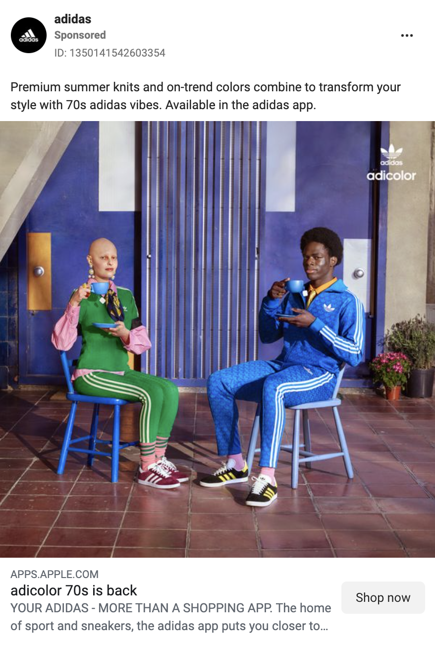
This campaign is focused on styles and colors from the 70s. When a user clicks on this ad, we can infer that they’re interested in this ad either because of the content Adidas is promoting, or because they’re simply interested in Adidas. Regardless of why they clicked on the ad, the ASO best practice is to lead the user to a CPP that will appeal to them by containing the same creative material.
This example can apply to any campaign where a CPP is linked, including Apple Search Ads (ASA). Apple Search Ads allows you to link a CPP to a keyword campaign to target a particular audience, including users who are seeking out your competitors. When designing a CPP to target a particular keyword, it’s important to ensure users will clearly see within the first 3 screenshots what they’re looking for.
For instance, an app with functionalities for both music and podcasts should not launch a custom product page in Apple Search Ads targeting the keyword “music,” while primarily showcasing podcast content in the first screenshots. Instead, the CPP should focus on music-oriented content immediately in the screenshot set.
3. Follow design best practices & store guidelines
When designing any creative elements for the App Store, it is important to follow guidelines put in place by Apple. In addition, creative design can be significantly enhanced by following best practices. Best practices are the result of collective knowledge and experience, representing techniques and strategies that have had positive results in the past. By following these principles, designers can avoid common mistakes, optimize creative output, and communicate effectively to future and existing customers.
- Use bold, concise captions: Remember, phone screens are small. Therefore, ensure that the copy on your app screenshots is large enough to read and has bold contrast against the background, so users don’t struggle to read it.
- Share your USPs within the first 2 screenshots: A USP is what your app offers that makes it stand out from competitors. You want users to see this immediately when they land on your app’s product page to ensure they understand the purpose of your app and want to download it.
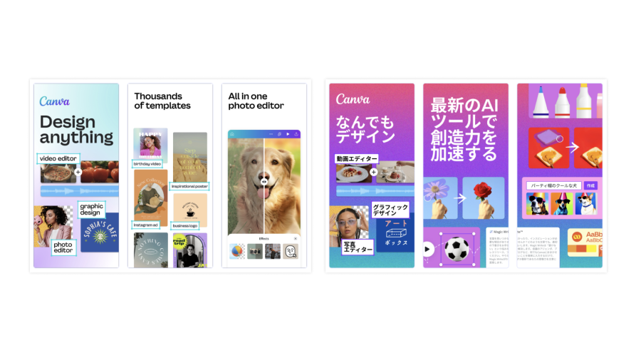
- Localize and culturalize your app screenshots: It is often not enough to localize your app using language. You also need to culturalize by researching the markets where your app or game is available, using colors, imagery, design strategies, etc. that will appeal to them. This would imply that creatives in the US typically look different than creatives in Japan. Canva, for example, uses simple backgrounds and minor overlap in their US screenshots, but their Japan screenshots have a bold, gradient background and incorporate a rainbow of colors in the layered imagery.
- Keep your app screenshots evergreen: If your team doesn’t have the capacity to update screenshots very quickly and frequently, ensure that your app or game has screenshots that won’t need to be updated more than every 3-6 months, in order to mitigate outdated screenshot creatives.
- Show in-app imagery: The App Store requires that creatives don’t mislead users, so screenshots directly from your app’s UI must be included clearly in the screenshots.
- Don’t make false claims: The App Store requires that apps and games only show accurate items and text in their screenshots. In addition, the App Store only allows users to display items they have the legal rights to.
- Keep it appropriate: Apple forbids the use of vulgar imagery or language, swear words, etc in app creatives. Screenshots must be appropriate for all ages.
- Follow size guidelines: A lot of time can be wasted due to incorrect sizing of design elements. To have a smooth design process, it is imperative to follow size guidelines the first time.
Conclusion
In essence, custom product pages offer app marketers a powerful tool to reach specific audience segments and boost their marketing. By grabbing users’ attention and piquing their interest, CPPs help apps stand out among competitors. Through embracing best practices, like segment identification, leveraging user reviews, ensuring seamless user experiences, and sticking to proven strategies, app marketers can unlock the full potential of their CPPs and make a lasting impact in the app marketplace.
NEWS
Article in relation
Cheat Sheet #4: Everything You Need to Know…
Mother’s Day holds a unique position in the marketing calendar. Mother’s Day 2026 will once again be an emotional milestone before it becomes...
Published on 9 March 2026
Google Ads 2026: 4 Tips to Adapt to…
Google Ads remains a core pillar of performance marketing for many advertisers. The platform drives volume, captures strong intent, and directly contributes to...
Published on 3 March 2026
UA Digest #13: What’s new this month?
Discover our User Acquisition Digest, your monthly update on the latest trends and news in performance marketing! Adjust releases its “Mobile App Trends...
Published on 23 February 2026

