App store vs. ad creatives: should you align or break the rules?

In a perfect world, a user would see an ad, click on it, land on a perfectly aligned store page… and install the app without hesitation. But in reality, the user journey is fragmented, and the visuals that work in ads aren’t always the ones that convert in the store.
This raises a recurring question for app marketers: Should creatives be aligned between ads and an app’s store page to reinforce consistency across the funnel? Many instinctively say yes. To stay true to the brand. To build a smooth, reassuring, coherent experience. But this pursuit of visual consistency isn’t always the best strategy.
In practice, user acquisition and app store optimization serve different purposes, and users don’t have the same expectations depending on where they are in the journey. Grabbing attention mid-scroll doesn’t rely on the same levers as building trust on a store page.
So the real question isn’t “Should you align your creatives?” But rather: When should you align them, and when is it better to break the rules for performance?
Key takeaways
- ASO and UA serve different goals, so visuals don’t need to be identical.
- Visual consistency works when it supports conversion, not when applied systematically.
- Some situations call for alignment, like strong brand identity or retargeting campaigns.
- ASO insights (keywords, reviews, top-performing visuals) can inspire paid creatives.
- UA results (high-performing ads or messages) can help improve store assets.
- Creating a feedback loop between ASO and UA, especially around creatives, is a powerful yet often overlooked opportunity.
Ad creatives vs. store visuals: two contexts, two goals
While app store and ad creatives may sometimes look similar, they serve very different purposes and are designed for distinct user expectations and attention dynamics.
Ad creatives: Grab attention
Ad creatives are designed to capture attention instantly in a highly competitive environment. The goal is to stop the scroll, trigger a reaction in just a few seconds, and deliver a message that’s simple, striking, and visually bold.
And in a context where targeting capabilities are increasingly limited (due to SKAN, ATT…), creatives also act as an alternative lever for targeting. Some visual variations perform better with specific segments, depending on the message, tone, or benefit highlighted.
In this context, the design’s role is to attract, surprise, and generate clicks.
App store screenshots: Reassure and convert
On the other side of the funnel, the app store page is designed to reassure and convert users who are already engaged. At this stage, it’s no longer about grabbing attention, but about confirming the user’s choice; highlighting the app’s concrete benefits, key features, and social proof (ratings, reviews, downloads…).
Here, the creative should clarify, reassure, and reinforce trust.
Because the goals of ads and store pages are so different, trying to align the visuals at all costs can be counterproductive. In some cases, using distinct creative strategies is not only justified, it’s the more effective option.
- Taptap Send’s usage of different branding for ads and app store pages
As an example, let’s look at Taptap Send. The money transfer app where the difference between ad creatives and store visuals is clear.
Taptap Send’s ad creatives are designed for immediate impact: meme-based formats that leverage cultural references, emotionally driven scenes (like a joyful user), and strong promises around speed, exchange rates, or zero fees.

On Taptap Send’s app store page, the tone shifts. The screenshots become more descriptive and reassuring: showcasing the app interface, clearly structured benefits, and references to reliability and security. The goal is to reinforce the app’s legitimacy, supported by trust signals like ratings, clean design, and reassurance-focused messaging.
→ Two creative approaches, each tailored to a different moment in the user journey, are both essential.
When should creatives be aligned?
Using different visuals across ads and the app store can make sense, but in some cases, aligning them is the better choice. Visual consistency helps create a smoother user journey and build trust.
Case 1: Strong brand identity
Some brands rely on a distinctive visual identity. In these cases, using the same visual cues across both paid and organic assets helps maintain consistency throughout the funnel, while reinforcing brand recognition.
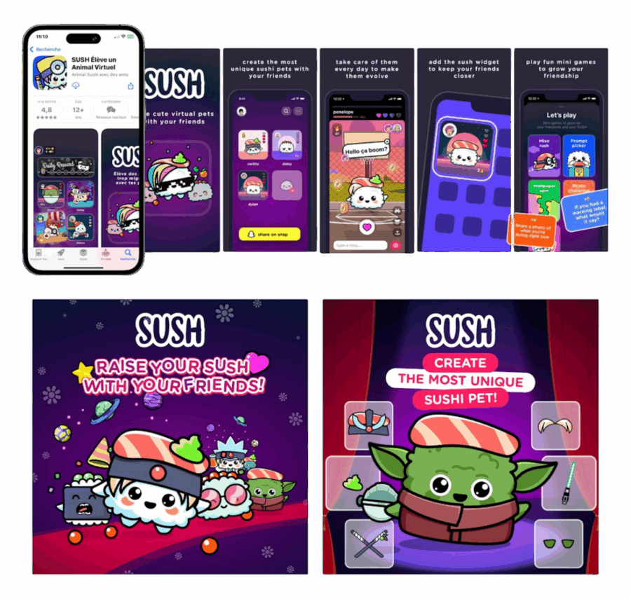
For example, Sush uses a highly recognizable brand universe, centered around its cute sushi-inspired characters. The same playful style, colors, and characters are repeated from ad to store, creating a seamless and coherent visual experience.
Case 2: Retargeting or remarketing
When targeting users who have already been exposed to the app, visual consistency becomes a powerful memory trigger. Reusing a familiar visual or message makes it easier for users to recall the app and take action, especially in a retargeting or remarketing context.
Visual alignment is not a rule, it’s a strategic choice. It works when it serves conversion, not when applied automatically.
The synergy between ASO and UA
App store optimization and user acquisition are often handled separately. Yet in both cases, the goal is the same: deliver a clear, relevant visual message to a targeted audience. That’s why signals from one channel can, and should, feed into the creative thinking of the other.
Use ASO insights to inspire paid creatives
Data collected through ASO tools, such as top-searched keywords, recurring themes in user reviews, or top-performing screenshots, can inspire new angles for paid campaigns.
These are actionable insights that help refine the messages, visuals, or benefits highlighted in ads. In this sense, the app store becomes a strategic testing ground for creative ideation in UA.
An example from a soft launch led by Addict Mobile for a gaming app illustrates this well. A/B tests were conducted on the app store visuals (screenshots, visual order, and icon). The best-performing elements were then adapted into ad formats for use in paid campaigns.
This creative continuity led to a 4x increase in the ads’ click-to-install rate. In this case, ASO optimization directly fueled the UA strategy, with a clear impact on performance. To learn more, read about how to design creatives for your app.
- How to get ASO insights for competitive creatives
AppTweak provides several tools to surface ASO insights that can inspire creative directions in paid campaigns.
With Creatives Explorer, teams can analyze and compare visual assets (screenshots, icons, promotional visuals, etc.) from top apps across markets for your specific app niche, spotting layout trends. You can then analyze competitors’ A/B tests, Product Page Optimization and metadata updates in AppTweak’s Timeline to inform your next move.
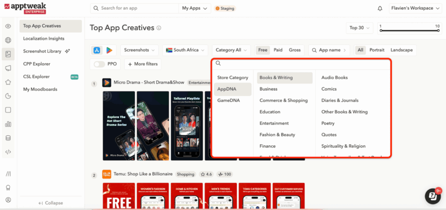
The AI Screenshot Library adds another layer by allowing keyword-based searches through thousands of tagged visuals, making it easier to explore how others structure their store presence.
Don’t start from scratch, take a page of what works creatively for your competitors and top apps in your category to get ahead!
Leverage UA performance to optimize store creatives
Conversely, UA results can also guide ASO decisions. A creative variation that performs well in UA campaigns, whether it highlights a specific benefit, uses a certain tone, or features a strong hook, can be tested as a screenshot or app icon on the store page.
This is often a faster and more data-driven way to identify which messages and visuals work, before integrating them into the organic experience. This approach is commonly used during app launches or product updates.
For example, if an ad emphasizing a particular feature, message, or benefit achieves a high click-through rate, it can be relevant to test a store visual focused on the same angle to measure its impact on conversion.
It’s a simple and effective way to validate creative directions quickly, before rolling them out on the store page.
- Scale what’s working
Once you’ve identified which messages or visuals resonate, whether through UA performance or ASO efforts, the next challenge is scaling those ideas across formats, languages, and channels.
This is where tools and production workflows come into play. For instance, Addict Mobile supports app marketers by combining human-led creative design with automated production. Their team uses an internal tool called Creathor to generate multiple ad variations quickly, adjusting copy, format, language, or visuals depending on the channel or market. It’s one way to speed up testing and expand what’s already working, without having to start from scratch each time.
Conclusion
There’s no one-size-fits-all answer when it comes to aligning ad creatives with app store visuals. It depends on the objective, the user’s stage in the journey, and the signals gathered across channels. In some cases, using different creatives is not just valid, it’s a strategic choice. In others, visual consistency can help strengthen conversion.
Above all, the connection between ASO and UA is often underused, especially when it comes to creative strategy. Organic insights can inform paid campaigns, and top-performing ads can guide store optimization. It’s by building these bridges that mobile marketers create stronger, more effective strategies.
NEWS
Article in relation
Google Ads 2026: 4 Tips to Adapt to…
Google Ads remains a core pillar of performance marketing for many advertisers. The platform drives volume, captures strong intent, and directly contributes to...
Published on 3 March 2026
UA Digest #13: What’s new this month?
Discover our User Acquisition Digest, your monthly update on the latest trends and news in performance marketing! Adjust releases its “Mobile App Trends...
Published on 23 February 2026
Full-funnel: why it has become essential in performance…
For a long time, marketing performance was mainly about conversion. Generating purchases, measurable leads, or app installs was enough to steer acquisition strategies....
Published on 9 February 2026

